My shopping cart
Your cart is currently empty.
Continue Shopping
The right interior door color can quietly improve an entire room.
It can make a narrow hallway feel calmer, help a low ceiling appear taller, or give a large open-plan space the architectural definition it lacks. The wrong shade can do the opposite. A door may look too stark against the wall, too similar to the floor, or disconnected from the trim and hardware.
When choosing between interior door color ideas, do not begin with the door alone. Consider the complete composition: wall paint, trim, flooring, natural light, hardware, and the visual proportions of the room. A successful door color should feel intentional from every angle, whether the door is open, closed, or viewed from an adjoining space.
This guide explains how to coordinate the most versatile door palettes, including white-on-white, tonal greys, warm neutrals, black accents, wood tones, and color-drenched rooms. You will also learn how sheen and lighting direction affect the final result.
Why does one white look warm and another look blue? The answer is undertone. An undertone is the subtle color beneath the main shade, and it becomes especially visible when two neighboring surfaces are placed together.
Before selecting a door finish, identify whether your existing finishes are primarily:
Your door does not need to match every surface exactly. It does need to belong to the same visual temperature.
For example, a creamy wall can work beautifully with a warm-white door, natural oak, and aged brass. The same wall may make an icy blue-white door look harsh. In contrast, a cool grey wall usually pairs more naturally with crisp white, charcoal, or a neutral grey door.
A useful sequence is:
This approach is more reliable than choosing a fashionable door color in isolation.
White-on-white remains one of the most effective interior door color ideas for bright, modern homes. It creates a quiet architectural envelope in which the door, wall, and trim read as one continuous composition.

There are two ways to use this scheme:
Using nearly the same white across all three surfaces minimizes visual interruptions. This is particularly effective in:
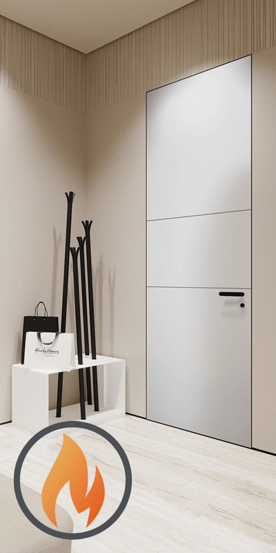
A flush door with concealed or highly restrained framing can make the wall appear more expansive. The eye sees fewer breaks in the surface.
You can create more definition by keeping the undertone consistent while changing the value slightly. For example, use a soft warm white on the wall, a brighter warm white on the door, and a slightly deeper white on the trim.
The difference should be subtle. If the contrast becomes too strong, the door may look visually detached.
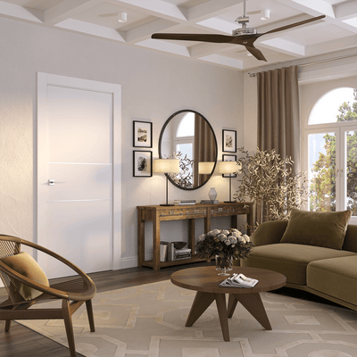
White doors also work well with pale oak floors. The warm grain of the flooring prevents the room from feeling sterile, while the light door maintains an open, spacious quality. For a refined European look, consider a simple flush design from the modern European interior doors collection.
Grey doors offer more depth than white without the visual weight of black. They are especially useful when you want the door to be visible but not dramatic.
A light grey door against a pale grey wall creates a soft tonal transition. A medium grey door against a light wall provides clearer definition. Charcoal introduces a stronger architectural accent.
The key is to keep the undertones aligned.
Tonal grey is particularly effective in rooms with several doors. Instead of making every opening a high-contrast feature, a grey palette creates rhythm across the wall.
Use the door and trim in the same grey when you want a stronger built-in effect. Keep the trim white when you want the door panel to read as a distinct architectural element.
Warm neutrals are ideal when you want a room to feel calm, collected, and tactile. Shades such as greige, taupe, soft beige, mushroom, and muted tan can connect a range of materials without appearing overly matched.

A warm-neutral door works particularly well with:
This palette is forgiving because it allows several related materials to coexist. The door can be slightly lighter or darker than the wall, depending on how much contrast you want.
If your room already has a strong wood floor, a taupe or greige door can prevent the space from becoming too wood-heavy. It adds color without introducing a competing material. Conversely, if the room feels flat, a slightly deeper warm-neutral door can provide the necessary layering.
For homeowners and designers planning a coordinated renovation, explore custom-order interior doors and frames to consider how door size, frame treatment, and finish can work together.
Black interior doors can add instant structure to an otherwise pale room. They are especially effective against white walls, warm greige paint, pale oak floors, and light stone.
However, black should feel repeated rather than isolated. Echo the door color in at least two or three smaller elements, such as:

A black door is a strong choice for a modern hallway, office, pantry, or study. It can also anchor a room with a large amount of pale flooring or light upholstery.
In a small or poorly lit room, consider using black on the door panel while keeping the surrounding casing lighter. This gives you the graphic effect without allowing the entire opening to become visually heavy.
Black doors are also useful when you need to create a focal point at the end of a corridor. The darker value draws the eye forward and gives the hallway a stronger sense of direction.
Natural wood doors bring texture and visual warmth that painted doors cannot fully replicate. They work well in Scandinavian, organic-modern, contemporary, traditional, and transitional interiors.
The most common mistake is trying to match the door to the floor perfectly. Exact matching can be difficult because wood varies by species, grain, lighting, and finish. Instead, coordinate the overall warmth.
A pale oak door can complement a slightly darker oak floor if both share a natural, warm character. A walnut door can provide a deep anchor against light walls and pale flooring. A wood door can also intentionally contrast with the floor, provided the relationship is clear.
Use these combinations as a starting point:
Avoid introducing too many unrelated wood colors in one sightline. If the room already contains walnut furniture and a warm oak floor, a painted door may create a more polished result than a third wood species.
Color-drenching means painting the walls, door, frame, trim, and sometimes ceiling in the same color or closely related shades. It creates a continuous field of color and makes the door feel integrated into the architecture.

This treatment works well in:
The room will not look flat if you vary the sheen. A practical combination is:
The subtle reflection on the door separates it from the wall without breaking the color story.
Deep blue-grey, olive, muted clay, and rich taupe are excellent choices for color-drenching. In a room with a ceiling below eight feet, be cautious with a dark ceiling. A lighter ceiling value can preserve a sense of height, while carrying the wall color onto the door still creates cohesion.
Color-drenching also requires layered lighting. Combine natural light with ambient, task, and accent sources so the shade remains dimensional throughout the day.
Sheen affects how light reflects from a surface, so it can change how the same color appears. A matte door looks softer and more absorbed. A satin or semi-gloss door appears more defined because it reflects more light.
For most residential interiors, this is a reliable starting point:
Lower-sheen finishes conceal minor surface irregularities and create a calm, editorial appearance. Higher-sheen finishes are easier to wipe clean, but they can reveal dents, uneven preparation, and fingerprints.
Do not judge a paint color from a small screen image or a tiny sample card. Place a large sample beside the wall, trim, and floor, then inspect it at different times of day.
Natural light can change a door color dramatically.
Artificial lighting matters as well. Warm bulbs around 2700K can make neutrals appear creamier, while cooler bulbs around 4000K or higher can make blue and grey undertones more pronounced.
Keep the color temperature consistent between adjoining rooms. A warm bulb in one space and a cool bulb in the next can make matching doors appear unrelated.
Color influences perceived scale.
A door close in color to the wall reduces visual interruption. This can make a narrow room feel wider and a busy hallway feel more composed. A contrasting door creates a focal point and can emphasize the direction of a corridor.
For ceiling height:
The best choice depends on whether you want the door to disappear, frame the room, or become a deliberate design feature.
Before ordering or painting, use this five-step method:
If space is limited, consider a pocket door collection to preserve floor area while maintaining a clean color relationship. For wider openings or a more flexible connection between rooms, swing doors and interior doors with glass offer different ways to manage light, privacy, and visual continuity.
The most successful interior door color ideas are based on relationships rather than isolated trends. Begin with undertone, then evaluate contrast, sheen, and lighting. A soft white door can expand a room. A grey door can add quiet structure. A warm-neutral or wood door can bring depth, while black can create a crisp architectural accent.
Always sample the wall, trim, door, and flooring together. Color changes as light moves across the room, and sheen can make two similar shades appear noticeably different.
Choose the door as part of the architecture. That is what makes the finished interior feel considered, balanced, and timeless.
A: Interior doors can match either, depending on the effect you want. Matching the walls makes the room feel more seamless and spacious, while matching the trim creates a clearer frame around the opening. In many modern interiors, the door and trim share one color while the walls provide subtle contrast.
A: White, soft grey, warm greige, natural wood, and black can all work with white walls. Choose warm whites and wood tones when the room has oak flooring or beige furnishings. Use charcoal or black when you want stronger architectural definition.
A: Doors do not need to match the flooring exactly. Coordinate the warmth and visual weight instead. A pale oak door can relate to a medium oak floor without being identical, while a painted door can create a deliberate contrast against wood flooring.
A: Satin is a practical choice for most interior doors because it offers moderate durability, subtle reflection, and easier cleaning than a flat finish. Semi-gloss can be useful in high-traffic or moisture-prone areas, but it may highlight surface imperfections.
A: Black doors can feel visually heavier in a small or dark room, especially when the casing and surrounding walls are also dark. To keep the effect balanced, use a lighter casing, repeat black in small accents, and provide layered lighting.
A: Yes. Color-drenching can make a small room feel intentional and enveloping by reducing visual breaks. Use different sheens to create definition, and make sure the space has adequate natural and artificial lighting before choosing a deep color.
Trade Program
Are You a Trade Professional?
Architects, designers, and contractors receive exclusive pricing and dedicated project support.
Learn About Trade Pricing →Get Started
Our team can help with product selection, sizing, and specification — at no charge.


